When scrolling in the editor view up and down the default scrolling behaviour is that Ardour will move up/down on a track based increment. So depending on the size of the tracks this is
a) very “jumpy”
and
b) very inconsistent because tracks can have different vertical scalings.
Both is causing irritation for the eye because scrolling causes tracks to jump in and out of view and after every scrolling my eyes have to readjust and reorientate where I am at the moment.
Is there a way to enable a smooth scrolling that is decoupled from the tracks and scrolls maybe on specified pixel increment, so that scrolling is more consistent for the eye.
Or has something to do with my mouse and maybe the OS mouse settings?
Ah, ok, too bad. But thanks for the quick reply.
I just saw that 9.0 is supposed to have dedicated pianoroll windows. Really looking forward for that. This way the track height will be less of an issue so I will wait for the update.
…
Am I gravely mistaken in thinking that implementing such basic GUI capablities would be relatively easy to accomplish? Is not including that simply a chosen style thing?
→ If in settings the user wants smooth scrolling, then a scrolling bar appears, and they’re free to use that, the mouse-wheel, fingers on a track-pad, etc., for smooth scrolling… (-Also up and down arrows, etc., to skip from track to track…)
→ But if in settings they turn it off, then you remove the scroll bar and simply stick with the current style.
Alas, you would be wrong. Making scrolling work track-by-track was quite challenging, and means that adding an alternative that does not work this way is non-trivial.
That’s why I am an advocate for the “make optional” philosophy.
Different people have different minds, brainstructures, thinking patterns and therefor different approaches to things, what is perfectly working out for one person might be an extreme obstacle for someone else. Giving options for UX is always best I think, but I also understand that there is a small team behind Ardour with a large roadmap to cover and other priorities to take care of.
As small note: there are lots of UI/UX examples that have been highly lauded that precisely do the opposte of offering options. macOS is likely the most well known one. In the hardware world, offering options in this sense is very rare (because it is so hard to do, and expensive).
There are really two schools of thought there:
“We know best, and the user should learn to use the incredibly fabuluous UI/UX that we’ve designed for them”
“People have different needs and wants, and we should let them adjust things to their needs and wants as much as we possibly can”
The problem for Ardour is that we’re ambivalent about these two philosophies. Some things, we take approach 1. Some things, we take approach 2. There’s no particular rhyme or reason to which.
My 2cents. Ardour is great. As with every complex application the user has to learn the UI and the way how things are done. I’m absolutely sure the developers try to find a way to make it easy for beginners and for people who change their DAW.
I like the way Ardour-users are integrated in the development by discussing options/ideas how things could/should be. Never everyone will be 100% satisfied … that’s how life works. BUT. One thing that makes me a little crazy is that I often miss okay/cancel buttons, so I have to use the close-window-cross in the upper right corner. Sure, using okay/cancel would mean that options/etc would not instantly propagated to the application. But sometimes it would be better if I could cancel, for instance when I’m not sure if I really did the right things.
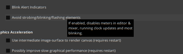
Another thing that made me crazy for over an hour was that the meters in the mixer didn’t work after I did a few changes in the preferences. It turned out it was the “avoid blinking/…”- option . This is COMPLETELY misleading, when I have a meter it HAS to blink/etc , not doing this makes a meter useless. Please make at least a hint that activating this will make the meters dead. Best regards
I forgot the third thing I’m not happy with.
Changing language (as I did minutes before to have the right English notation for discussing here)
is a useful thing. BUT. I can only choose between English and the local language which is used by the os.
I don’t really know but wasn’t there an option in older versions where I could decide which (installed) language I wanna chose ? One use case is foreign user on my system, who wants to have a - lets say - french UI …
Best regards
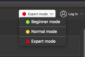
You could always lean harder towards option 2, BUT have different preference ‘modes’ to choose from.
In Prusa Slicer, for example (-a slicer program for 3D-printing), they increasingly reveal different options to the user based on the mode they’ve chosen to use, thus:
…
In fact, I’m just going to post this to “Ideas for Ardour” 'cause why not? …
I have a strong opinion that it’s the developer’s job to take input from many sources, and then implement the “best” option, without presenting the user with tons of alternatives which must then be supported, and very often compromise the product vision.
Smooth-scrolling implies that you sometimes have only a partial-track visible at the top of the screen. We take significant pains to avoid that.
However, it is not inconceivable to reimplement the track scrolling so it has the smooth-scrolling ‘aesthetic’, but then it always snaps to the top of a track when you stop scrolling.
The tooltip for the anti-epilepsy option looks like this:
Not sure how we could make that more clear?
As for the OK/Cancel buttons, this was a design decision we made long ago. When a dialog has no confirmation step (for whatever reason), we don’t add an additional button to close the dialog, because 99% of all desktop environments will provide that in the window decorations.
There are dialogs that require a confirmation step, and those will (or should) have both an OK and a Cancel button. There are dialogs that because of the way they work do not do this. It’s not unreasonable to aim for complete consistency here (i.e. all dialogs require a confirmation step, or an apply step), but that has not been a design goal thus far.
Personally I’d say ‘Avoid strobing elements like meters’. People (like myself, obviously) tend to not read the tooltips it seems. Even more obvious would be removing the meters if the option is enabled or adding a tooltip to them explaining ‘hey you disabled your meters that’s why they are flat’.