Just another biyearly reminder that you should re-implement Smooth Scrolling

Again, this ‘blocky-scrolling’ style native to current Ardour (i.e. jump to the next/previous lane (track/bus/automation) per mousewheel click) should be an option, alongside a more-typical, smooth-scrolling alternative.

Here are some examples of why this style looks and feels ‘unnatural’:
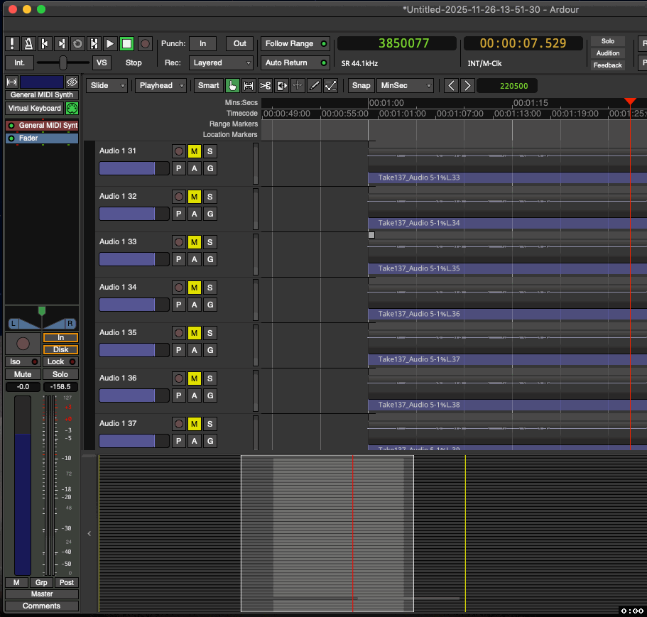
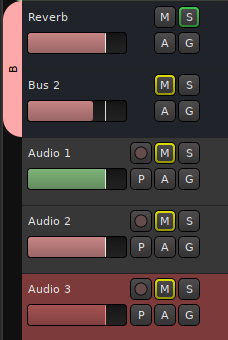
Exhibit 1:

Tracks of similar height, name, and look don’t even look like they’re scrolling-by even when they are.
This lack of motion feels unnatural.
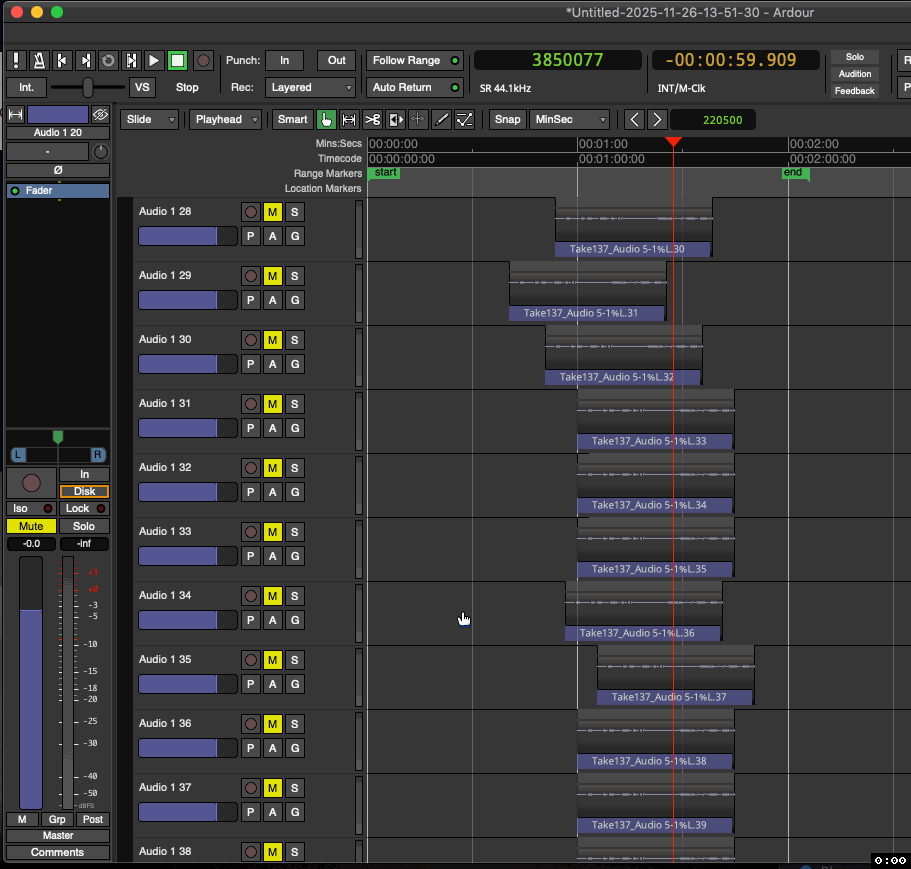
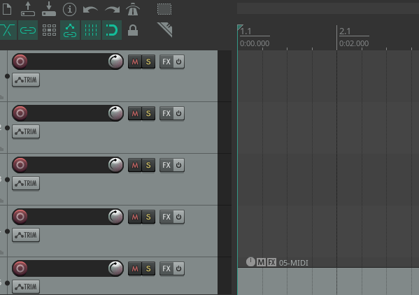
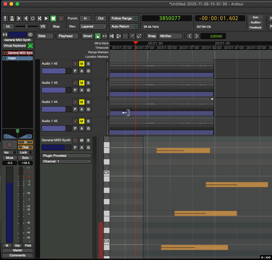
Ardour (8,12+) - Blocky Scrolling Is Annoying (1)

Exhibit 2:

Audio or midi tracks that you wish to vertically extend beyond the screen-size simply will not show you what lies below, unless it’s a midi track in which case you can use the red scroll-bar, but this is not as efficient (or pleasant (imo)) as simply scrolling smoothly with the mousewheel (or trackpad) would be.

Ardour (8,12+) - Blocky Scrolling Is Annoying (2)


All in all, if the rest of one’s OS doesn’t follow this behavior, then this blocky-scrolling in Ardour will never not be annoying. It just won’t ‘feel right’.

That said, I’m sure some users are totally fine with it, which is great.
But for me, after years of using Ardour, it’s still bothersome…

Now obviously Ardour isn’t unusable because of something like this. But this type of UI choice (with no alternative) continues to make Ardour feel kinda ‘clunky’ right out the gate. The idea of blocky-scrolling on paper sounds okay: seems nice and neat and organized, etc… —But the actual user experience is not necessarily preferable.

Anyway, thanks for at least reading (…before re-rejecting this idea :P) !
-Joe L.

:+1:

6 Likes

is exactly what I expect should happen: Never show half a track.

Haha, I saw what you wrote there… : P
And yeah, and don’t see the summary view changing here as I scroll:

Ardour (8,12+) - Blocky Scrolling Is Annoying (3)

Obviously my examples are extreme, but they’re just made to highlight how annoying this behavior can be.


Now what do you have against half-tracks? :upside_down_face: :thinking:
Again, I think the most important point here is:

“…if the rest of one’s OS doesn’t follow this behavior, then … It just won’t ‘feel right’.”

-And it still doesn’t.

It used to show vertical scroll in the past.

1 Like

About 1- I suppose that if you had regions at different time positions across all tracks, you wouldn’t have as much of that blocky effect (?)

Yes, I get your point.
As I said, my examples are hyperbolic to somewhat exaggerate the worst of this UI choice.


But which one of these does your brain prefer?
Which one makes more sense for what you expect when you are scrolling?

A:

Ardour (2,8,16) - Smooth Scrolling Example (1)

B:

Ardour (8,12+) - Blocky Scrolling Example (1)


There’s really no sense of project scale/size with B.
There’s a ‘flatness’ to it. -A boring, linearity.

Also…
Imagine this in any other context:
Imagine browsing the web like this, where only discrete lines of text could appear (-no “half lines”).
It would be infuriating.

Again → unnatural.

When we slide a paper across a table, it doesn’t jump in discrete, quantized chunks for our “convenience”. We see it smoothly transition from one place to another. So why change this basic, fundamental expectation?

…Have I made my case yet? :face_with_raised_eyebrow: :grin: … -___- :question:

At this point, I would hope that the only thing stopping the devs from just adding this option to Ardour is simply the effort it would take to implement it, as expressed here by Paul, which I suppose I can sympathize with:

Because having, again, this option, would not at all harm Ardour. For many out there, it would probably be a mild to significant improvement. -A nice, polished cherry on top of an already fantastic piece of software!~ :cherries:

-J


[EDIT: And by the way, I don’t really think I’m nitpicking here. :question: This sort of thing might seem trivial and unimportant to talk about, but it’s truly a fundamental aspect of how one interacts with the software (-at least the Editor View).]

I don’t think your are nitpicking, it’s a fair point, especially if you’re a user having to deal with Ardour everyday on complex projects. I just personally never was bothered by it.

About your comparison, I understood it was hyperbolic but still, if you want to compare what you think is good and what’s not, at least have the same color scheme :slight_smile: The “bad” option is plagued by having all regions with the same dark color, without much contrast with the background.

Instead, and I don’t know if Ardour does this already but it seems less drastic to implement than smooth-scrolling, the track header could have a unique color (one per track). Bitwig does this by default and you can even choose the color afterwards if you don’t like the random pick after track creation.

1 Like

The rest of your OS is not an authoring app.

Compare to e.g. blender, or other non-linear editors; the usual rules don’t apply there and user-interfaces are very specific.

You could show the track number, which also uses the color…

1 Like

Good tip, I did not know that. But could the whole track header display the color (not asking if it can already but whether it could in the future) ?

We have no plans for “whole header coloring”.

1 Like

There is however Preferances > Appearance > Color faders with track/bus color

image

4 Likes

Okay, sure…
But…

Here’s a window in Blender where scrolling is necessary; with discrete up and down increments with each mousewheel click (as to be expected), but smooth motion using the scroll-bar (and presumably trackpad):

Blender - Smooth Scrolling Example (1)

I mean it’s almost universally present no matter where you look.

Again, I’m not saying this blocky-scrolling shouldn’t exist. If someone loves it, then they should keep it! The more flexibility the better! —I’m just suggesting that Ardour should include the option to switch to a smoother, non-discrete style if desired.


As for all these sorts of editing/organizing aspects of Ardour, I use them all the time and I love it! It’s how I keep everything neat and organized and as easily-decipherable as possible. :grin: :+1:

Oh Ardour also has those scrollbars for settings, numerics, processor box, property.
just not on main editor and mixer canvas. Compare to blenders video timeline.

Okay, yes, fair point. That would be a fairer comparison.

I’m totally with GhostsonAcid. Don’t ask how often I lost track of where I am because of the blocky scrolling!

3 Likes

I’m with GhostsonAcid. Ardour used to have scroll bars and they worked fine. This is not scrolling this is jumping and I find it confusing like GhostsonAcid.

3 Likes

Although I see the benefits of the current scrolling implementation, if I had the choice, I’d switch to smooth scrolling too. What bothers me most is when I have a couple of tracks taller than the others. When scrolling past them, the vertical position of the other tracks changes quickly, and it is easy to get lost.

Thanks @GhostsonAcid for bringing this up.

3 Likes

—Exactly! :100:%

Just look at this example from earlier…
Tracks seemingly just appear and disappear in a, again, unnatural or unexpected (w/respect to our deepest expectations of movement) sort of way:

Thanks for the comments, guys!
I knew I wasn’t alone on this.


Sorry, devs, the mob has spoken. :upside_down_face: :grin: :tophat: :sparkles:
:monorail: :man_dancing: :man_shrugging:

Sorry, Mom, The Mob Has Spoken (1)

2 Likes

Smooth scrolling in Reaper works well, half tracks not an issue there. Having a scrollbar is also helpful, especially when you want to quickly scroll to a specific place.

Peek 2025-11-27 11-52

2 Likes

Why not make it look smooth but always move until the tracks are displayed completly?
To me this would be best of both. :smiley:

2 Likes