You’ve done a nice job, I don’t think it differs enough in theme from the original to be a replacement but I would agree that the splash screen could use an update…
Here is a second experiment. I think it turned out better. Decide for yourself. If you
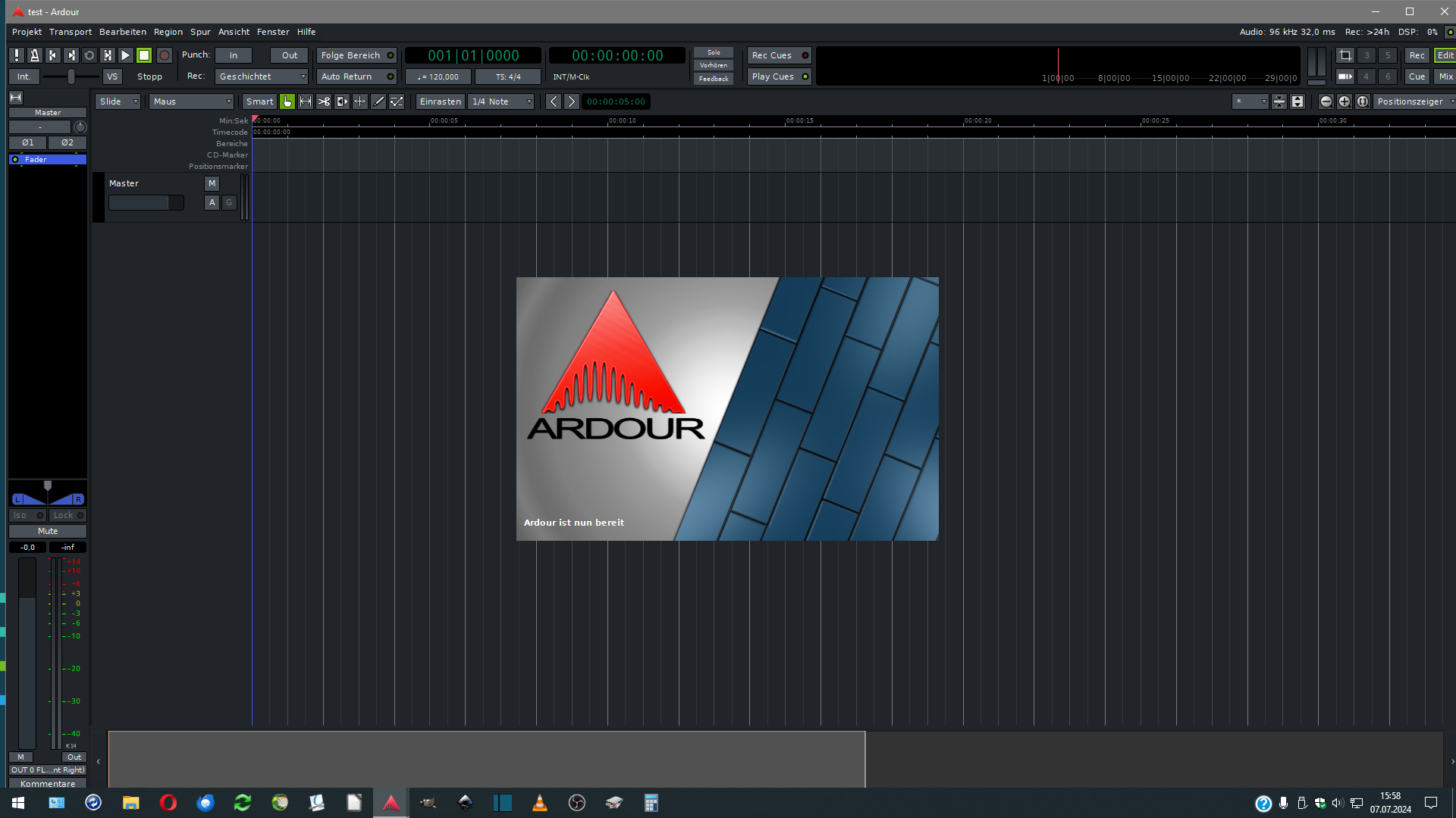
like it, just save it under . . . \Ardour8\share\ardour8\resources . . . . .
I would a agree that the logo and in-house font have indeed aged well, you don’t ever want to mess with the product recognition of a good logo. I do think the backdrop could use an update though…
Thank you for your feedback. I just experimented a bit. Unfortunately, I don’t have the original font. The logo itself is the original that I used. I’m sorry if it didn’t turn out quite right. I thought I had to change something on the welcome screen to make starting Ardour more attractive. The program itself is well done. Maybe it’s time to bring a little more design into Ardour. Maybe we should hold a little competition for a new logo and a new welcome screen. As the saying goes: what you see is what you eat with. Personally, I like the second option. The design should never be left behind. Think about it. I would be happy to help. You just have to tell me how I can help. Thanks again for your feedback.
I’d prefer to keep the splash screen as it is. It’s simple, familiar and somewhat timeless. Without wanting to offend anyone, I don’t think any of the designs proposed here are an improvement on the current version. If you really want an upgrade, I strongly suggest hiring a professional designer to do it.
Hallo, Oooooh . . . Another little experiment. Wow . . .
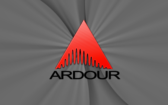
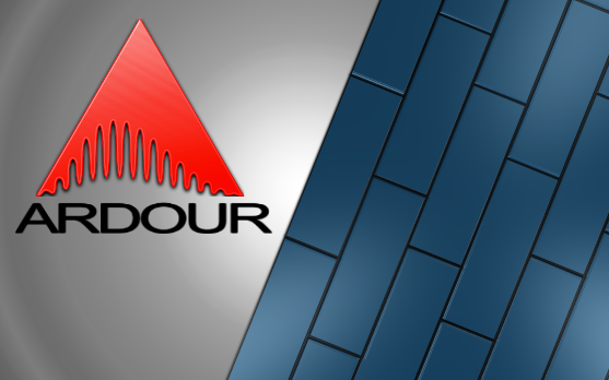
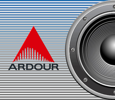
Ardour-splash.png
before:
after:
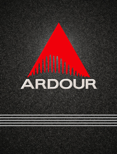
Ardour-small-splash.png
before:
after:
The Ardour logo and the set of carefully “hand-drawn” letterforms are now original. If you like it, just save it to . . . \Ardour8\share\ardour8\resources . . . . .
I’ve dared to try another experiment. If you like it, just save it under . . . \Ardour8\share\ardour8\resources . . . . . There are better ones. Maybe someone likes brighter welcome screens. I put a lot of effort into it and was happy to do it for you.
I still prefer the before in all instances. I like simple flatter designs. I don’t think there is enough contrast in the white one between the text and background.
Yes, the flat vs. shadowed debate, although I think flat is starting to get wearisome, I wonder what’s next…?.
I think since Ardour doesn’t at all try to look like real hardware (ie fader belts instead of faders, no 3D knobs or VU style metering etc…) a splash background with literal hardware (ie the speaker) probably doesn’t thematically fit. Some other DAWs use a stylized backdrop of the DAW itself in action usually some kind of perspective tilted screenshot which can look effective if done well.
Hello, this time I have chosen a simple design. After extensive research on the Internet, I found out that Ardour is the best free DAW for music production in terms of price-performance ratio. I thought that this welcome screen would make Ardour even more beautiful. If you like it, just save it under . . . \Ardour8\share\ardour8\resources . . . . .
Ardour-splash.png
before:
after:
Ardour-small-splash.png
before:
after:
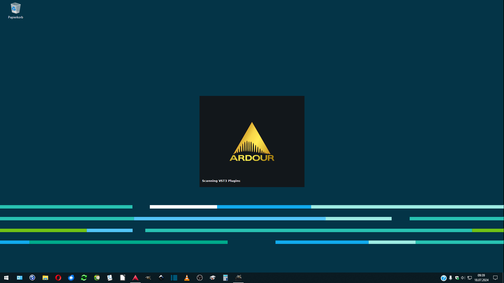
Here are a few photos from the program launch. There’s something royal about it.
I was about to reply with a harsh “what’s wrong with the old logo/splash screen, that you want to change it?” (you know: I’m old and grumpy).
Then I saw this latest proposal. As it turns out, I really like it! Simple, elegant. Timeless. The old was was timeless as well, but this one feels more… sophisticated and expensive.
hello, thank you for your valuable feedback. I really appreciate all feedback and I really try very hard. Glen MacArthur’s suggestion to record the state of things in Ardour in the welcome screen is also not a bad one. I will try that too.
If you like it, save it under . . . \Ardour8\share\ardour8\resources . . . and check it out.
There are better ones. Trying to go in the direction you want is unfortunately not always easy, but you alone decide. Thank you!
Here is another welcome screen. Something different. Check it out and check it out on your computer.