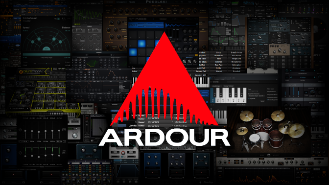
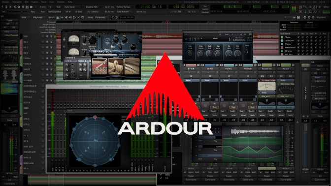
You could also put your studio’s own logo there to impress clients.
Ohh now I’m tempted to make a “Ardour PRO 64bit” edition splash screen !
Maybe you guys could add a script that prints a text string under the splash logo that says “This build specially prepared for [USERNAME]” ![]()
![]()
Hello, today I tried an experiment that looks a bit complicated, but isn’t that bad in terms
of construction. This welcome screen is more for the really snappy. If you like it, just save it under . . . \Ardour8\share\ardour8\resources . . .
Ardour-splash.png

Ardour-small-splash.png

With musical greetings
Unknown
In my opinion this is more on the right track, I think a little more “Ardour” canvas/mixer in the background and a few less Plugins would be better, The Plugins make it a bit more OS-specific where just having Ardour itself as the primary background would be more generic across all Platforms…
Maybe some people with advanced workflows (ie MIDI + Audio, lots of Automations etc…) could share a screenshot and that could be used for background material? I personally do 99% Audio and very little Automations so my screenies would be pretty boring.
Now it is time to demonstrate your skills. Everyone is cordially invited to create a start screen and publish here. Just no shy and please do not push. There is space for every start screen.
With musical regards
Unknown
Ooooh. So . . . I still have a start screen. I tailored this start screen a bit to Ardour directly. If you like it, just save it in the folder mentioned above.
Ardour-splash.png

Ardour-small-splash.png

With musical greetings
Unknown
Here you can show your creative ideas to other Ardour users without worrying. Nobody embarrasses themselves here. Every user is a star here.
With musical greetings
Unknown
This somehow looks weird to my eye.
The font is too thick and does not properly align to the increased number of teeth.
Why not stay with the original for that part at least?
Thank you for the tip… Robin. Now it’s time to use your creative imagination.
Let’s see your new idea for a new start screen. With the old Ardour logo and
a super new background. I’d love to see it.
With musical greetings
Unknown
An icon represents and identifies something, just like the human’s face. And the simpler, the better, the KISS principle is crucial here.
The current Ardour logo fits in almost any place one throws at it because of its simplicity and timeless graphical design, I think that one can even use the slightly decadent saying: “If it works, don’t fix it”. Another excellent thing about the current one is that it survives any short-term fashional stuff like colors, dimensions, and shapes, so far, it stands like a rock - at least IMO.
That said, it’s in human nature to improve, make, or change anything that comes her way, and the list of altered icons is long, sometimes with a bad result. One big failure in my opinion is the new green LV2 logo which one has to study to understand what it says, on the older one, one just had to have a short look to identify - just like a face.
That doesn’t mean one should not try to improve stuff, but it’s not always for the better. One of the hardest things to do is do things very simple, so simple that it ages well; I think the wheel is such a thing.
Wow . . . With these arguments, I find it difficult to continue convincing people to change the start screen. I give up. Thank you for your time on this post.
The post can be closed. Thank you again.
With musical greetings
Unknown
Well, providing alternative start screens to the community and changing the official start screen (and logo) are two different things. While the latter is very unlikely, the former is perfectly fine !
There is nothing wrong with customizing things to fit your particular desires, that is part of the strength of open source. But not everyone has the skillset or desire to do so, and thus sharing your work for others works, but so does having professionals with that skillset and desire work on something and make it ‘good enough’ for the majority of people out there.
So nothing wrong with customizing and sharing your work, that is the spirit of open source in a nutshell. Just understand a lot of work went into the official by people with the training and skillset to make something that works well for the rest of us, and that the developers aren’t likely to change a default any time soon without a lot of good reasons why. (This is without going into the topic of the importance of branding etc.)
Seablade
Although I am not inclined to customize the start screen on my end, I enjoyed seeing your ideas, and prior to this post, I didn’t realize the start screen was customizable. I suppose anything in Ardour can be customized given it is open-source, but seeing a user add some of their own flavor to the look of the program was interesting and a bit inspiring.
I agree with others that the logo and font is best kept consistent with the official branding, but I thought the one with the screenshot of Ardour behind it looked pretty good. Don’t get discouraged if you want to keep offering suggestions on the start screen or other aspects of the look of Ardour just because you didn’t get as positive of a reaction as you had hoped in this thread. Even if the developers don’t incorporate your ideas into the official binaries, there may be other users that use them, or perhaps it leads to you or someone else having a design idea that ends up having an impact. I didn’t read any comments here that I thought were argumentative, just some constructive criticism.