In the dark themes, the note length button graphics are different from the other buttons. Black whilst everything else is white. This makes them difficult to see.
Conversely, in the light themes, the problem is the middle set of buttons stay white.
Idea is to make them more visible whatever the theme.
Totally agree! Thanks!
Unfortunately I can’t find the customizable Items in color manager. I’ve turned all pallet colors to grey - the buttons stay the same. This is hard-coded somehow I suppose. The standard theme customization have no possibilities in this case (AFAIK).
And, yes, this objects must be inverted from dark themes to light// May be a feature request could be possible…in future.
The button icons are png, which will be why they don’t theme. They live in /usr/local/share/ardour7/icons which means they can be manually changed at least as a workaround. Obviously it would be better done in the theming.
Fine tip. Thanks! A problem as I understood - your png changes are good for dark themes, but if we want to change a theme to light - we need to edit /usr/local/share/ardour7/icons again manually?
White icons with black outline or black icons with white outline would be visible on both white and black background, but probably they would look better on one than on the there (which is better would depend on exact design).
Yeah that’s right but if you are going to change from light to dark often, keep a set of the icons in black and keep a set in white in separate folders and copy them across when needs be.
Or you could use svg format for icons. There are over 100 png files in that folder that will all have the same scale problem. For theming, have sub folders in the icon folder for custom icon themes. i.e. /usr/local/share/ardour7/icons/default for the default set etc.
Also ~/.local/share/ardour7/icons/customthemenamehere could be used to place custom icons.
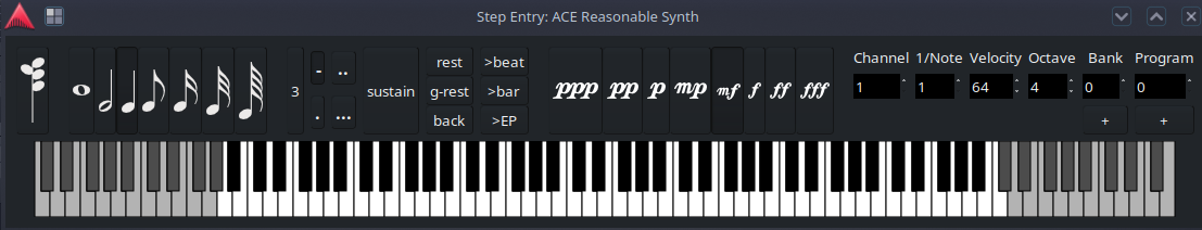
I went with UTF-8 font. That allows for easy theming using existing Ardour infrastructure and just works™ with existing themes. – svg coloring is a lot more complicated.
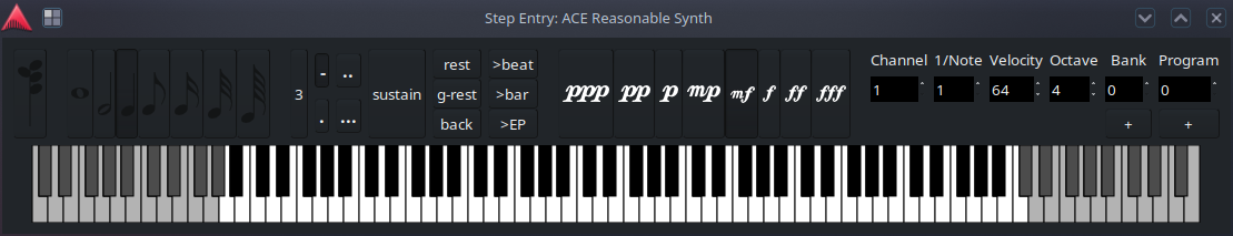
Ardour since 7.1-141 with the default dark theme now looks like
There’s still a bit of pixelpushing to be done to improve the layout. Some space between the buttons would be nice; other buttons should also be themed properly, and overall interaction improved, but that’s a different story.