I know that v7 is not ready yet and requests are prohibited, but…
Can you please bring back the lines between Meter/Tempo/Markers rulers, maybe as an option? Please… I really like these lines. ![]() Maybe it’s not too late yet to give us an option.
Maybe it’s not too late yet to give us an option.
I know that v7 is not ready yet and requests are prohibited, but…
Can you please bring back the lines between Meter/Tempo/Markers rulers, maybe as an option? Please… I really like these lines. ![]() Maybe it’s not too late yet to give us an option.
Maybe it’s not too late yet to give us an option.
Can you elaborate? Which rulers or lines are missing?
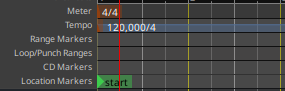
Black horizontal lines between Meter/Tempo/Markers in the upper section of the Editor.
V6:
V7:
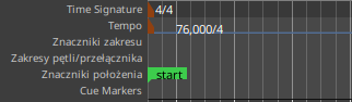
They were intentionally removed to reduce visual clutter and instead rulers now highlight when you hover over them.
There is currently no preference to optionally show them.
![]()
I really liked them…
I had not even noticed that they were removed and had to check the git-log and ask the developer who removed them…
I suppose we could make it a GUI preference to show them on demand, or make them themeable (with the default being transparent, invisible). I’ll have to check how much work that would be.
Reduce visual clutter !!! Demarcation lines between UI elements is not visual clutter - it actually helps you see WTF is going on! Is a spreadsheet less cluttered because you remove all the lines between the cells!
As opposed to a spreadsheet, markers on different lanes have different shape and color.
In the mini-timeline they are even displayed on the same row.
Anyway I don’t have a strong opinion on this one. It might make sense to separate different types (time/tempo related, location related, video related) of rulers.
When you look at the right-side of the screen, 6+ close separator lines are likely not helpful by themselves without the eye moving back to the left.
Right, the markers might, but having them all scattered across a sea of grey with no borders giving visual cues as to which lane they might be on is more the point.
Maybe using a lighter colour (dark grey) instead of black, as a border, might not look too distracting. And/or striping each lane with an alternate lighter grey colour would help guide the eye.
In V6 under – Preference-Appearance-Colors some items like “marker bar”, “marker bar seperator” and “range marker bar” had choosable colors.
That is (was?) very convenient. Dio I understand correctly that these preferences are removed too?
These already gave the possibility to reduce visual clutter.
A few months ago, I added the ability for the mouse to ‘highlight’ the ruler when you mouse-over it. This allows you to follow the highlight to the left and right to see the header and markers associated with that ruler lane. This was a big improvement … roll back to a prior version and you’ll certainly miss it.
I removed the 1-pixel separator lines because I felt they generated unnecessary noise and imho gave ardour a ‘dated’ look compared to cleaner/newer UIs.
If that bothers you, I apologize. But someone has to make these decisions as best they can. It is not practical to make (and test, and document, and support) a configuration option to revert every gui change to its prior state.
I believe it is still possible to theme each ruler lane with a different color, if you want to separate them that way. (look for “meter bar”, “marker bar” etc)
(edit) as a final thought, I’ll point out that there’s a natural separation between the ‘clock’ rulers and the rulers below. There’s a natural separation of the BBT rulers (due to the tempo-line) and the rulers below. Considering that few users will use the CD ruler these days, and those that do probably won’t use the Cue lane, you’ll likely have 4 or fewer lanes to differentiate. What I saw was: the theme-creator makes nice graduated ruler lane colors, and then the user picks arbitrary lanes and any aesthetic effect was lost.
-Ben
This topic was automatically closed 28 days after the last reply. New replies are no longer allowed.