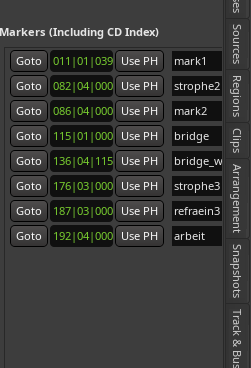
i would like to see the tab “regions & marks” on the right side not first goto and then the timestamp and then the name of the region on the right, but the other way round. first the name of the region (and this preferably clickable) and then the further information
like this:
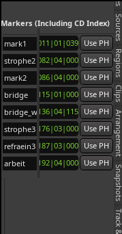
@acek FWIW, you might be missing the fact that the marker label is editable in that view: making it clickable (i.e., a button) would remove that feature (the bar / beat / sample widgets are also editable).
@tseaver That’s right, just for the sake of the idea (though I’m not convinced it’d be better ![]() ) this could be done like left-click for “goto” and right-clik for “edit name”
) this could be done like left-click for “goto” and right-clik for “edit name”
thanks, i already understood that the names are editable. my wish would be that the names of the markers are displayed on the far left of the editor list so that the panel doesn’t have to be so big.
This topic was automatically closed 91 days after the last reply. New replies are no longer allowed.