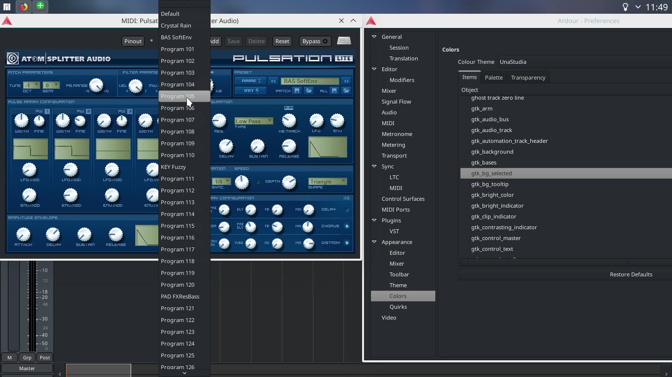
Just suggesting to remove the rounded corners and gradient from the menu selection and maybe making selected item text use the gtk_fg_selected colour instead of gtk_foreground as it makes menu items look slightly out of place in the (otherwise beautiful) interface! Here’s an example: (selections in Preferences vs in menus)…