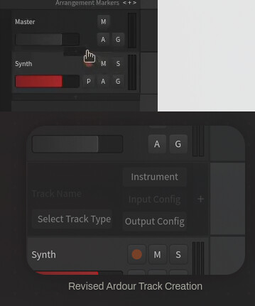
I designed some fixes for a few UX interaction pain points in Ardour (not a whole redesign)

Hi all, longtime Ardour user here (jumped around DAWs for years, landed here and stuck). It really is an impressive piece of software, and lately I’ve gotten a lot more into open source generally, which made me want to dig into this properly rather than just gripe about it in my head. That, and I’m a UX designer currently job hunting (in this economy? lol) so I figured I’d put the itch to good use.

Over the past week I picked four specific interactions that I felt created unnecessary friction, and worked through concrete alternatives. This isn’t some crazy redesign, just some scoped fixes to things that currently open a popup window or deeply nested menus for a simple action. The interactions I addressed are:

  • Creating a new track (the Add Track window is a lot for the repetitive action of creating a track)
  • Adding a plugin (when outside the mixer view) (has to be inserted with precise right-click between existing plugins)
  • Editing a MIDI/audio clip (the context menu mixes clip-specific actions with playback/selection options)
  • Accessing a plugin’s pin connections (currently its own popup window, feels unnecessary)

You can see the details and thought process here: https://jamesburtonevans.com/projects/ardour-ux/ardour-ux.html

My GitHub repo also has more information: https://github.com/jamesburtonevans/Ardour_UX-Revision

I’m open to any thoughts and feedback. And if there’s anything I can do to help with the UX and other aspects of Ardour let me know.

8 Likes

~Good work and ideas! :+1:

My favorite idea you’ve presented is adding a plus button between plugins/processors in the mixer strip if you hover the mouse there for like a second. Up until now I’ve mostly been double-clicking in the black-space after all processors (-which opens up the Plugin Selector window), choosing which one I want to add, adding it, then just dragging and dropping it into the desired place. Manifesting a specific button between processors would no doubt feel much more convenient in many situations.

-J

That is very much not ardour-like and in general just a waste of vertical space, even more so for downstream projects (think Mixbus). Just right-click in the ballpark location where you want plugin and Ardour makes space for new plugins to be added in the processor box.

The continuous non-slot processor box is a bit of a hallmark of Ardour as well.

PS. you can also drag/drop plugins to the right location. Directly from the plugin selector, or from the sidebar.

1 Like

You can right-click on a plugin to insert a plugin before it.

3 Likes

Thanks for diving into this and not just criticizing but providing constructive feedback.

I find the examples you provide interesting, since those are rather uncommon operations in the overall record/mix process. So I am curious how you arrived at those. It is probably very workflow dependent:

I usually spend less than 2 minutes adding tracks for a song that I work on for 3 or more days. So it does not seem something to be optimized. Besides it can be very efficient (Ctrl+Shift +N, Enter, uses most recently used settings). We also had a much simpler dialog in the past. With increasing number of features discoverability and built-in documentation (learnability) became important.

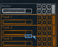
I would expect a button between tracks would get more in the way when mixing in anger,
and it isn’t discoverable:
image
Besides, what track would be added? How many? which channel layout?

Pin-connections is another interesting choice. There should almost never be the need to customize them. It’s a rather advanced feature. In some cases with mid/side setup, or for parallel compression is is handy to have it visible in addition to the plugin’s UI. Besides, there is also the view that shows it for the whole route (not individual plugin), which needs to be in the whole window.

The interaction design rule that we adopted for Ardour is : If in doubt, right-click somewhere.

That does indeed lead to some long context menu, which could be organized better.

nitpick: I think you mean “Editing a MIDI/Audio Regions (not clips)”. Ardour terminology uses regions for - well - regions on the timeline; and clips for clip-launching.

The problem is that one can operate on multiple selected regions, which is the reason why there is the sub-menu. That could indeed be improved. As you may have noticed the sub-menu just shows the main menu’s “Region” menu there as-is. One benefit there is, again, discoverability. Here for keyboard shortcuts.

I also disagree with the design goal to reduce use of popup windows for applications. Dialogs are a key element. There should be as much information presented to new users as possible to improve learnability of a rather complex piece of software. Pro users will just use keyboard shortcuts and ignore them.

3 Likes

Thanks for the feedback! I agree with your point that these operations aren’t the majority of the recording/mixing process; in fact I can say that once I am past many of these operations (like once I have most of my tracks created) I find being able to really be in a flowstate working with Ardour. Most of its UX is handled really well in my opinion. To me though, the more pop-ups and non-context-specific nested menus there are, the more I’m having to search for an option or manage windows. But then again, as you said, pro users can always just learn shortcuts.

With my idea for the track creation workflow here was my thought process. Especially as someone who uses MIDI instruments a lot, it bogs me down having to use as much screen real-estate as I do with the Add Track window. My idea with the temporary-track as the creation workflow (shown on penpot document, article, and video) would be that for one-off track creation, the user can just create a track (with all the settings available in the existing window, minus amount).
image
To be honest, I don’t think these would have to be mutually exclusive. The existing window is useful for creating a lot of tracks and then never touching it (as you mentioned), but when I’m in a creative flow and want to add a new instrument or sound to my project, I find dealing with the interface to be quite cumbersome. But again, I get where you are coming from.

I think the balance is presenting as much information available that’s relevant to what is being done (so a new user can find the operation they need to perform) while also not entirely overwhelming them with too much information.

But yes, thanks for the response and continue doing the great work that you do

4 Likes

Have you ever considered replacing some of those ridiculously long context menus with a simple, scrollable dialog box? Menus such as the assign for controllers and some of the plugin selection menus are frustrating to use, especially in the dark, using a laptop trackpad, rushing before a show…I have many times called upon the gods to strike you down for this.

I think you have some interesting ideas, thanks for showing them off.
Here’s some appreciation for you efforts :slight_smile:

1 Like

Damn :slight_smile:
…just a simple right-click on the next plugin in line…
I struggled with this also, the identical way as the author of this thread.
Thanks.

1 Like