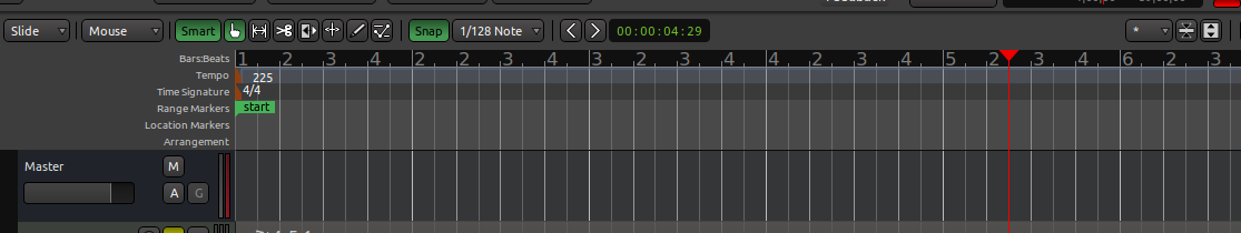
the timeline’s main bar numbers and beat subdivisions use identical numeric styles, resulting in hard-to-read sequences like:
1 2 3 4 2 2 3 4 3 2 3 4 4 2 3 4 5 2 3 4 etc.
Is it possible to differentiate them?
[Ardour 8.12.0 on Linux, built from source]
the timeline’s main bar numbers and beat subdivisions use identical numeric styles, resulting in hard-to-read sequences like:
1 2 3 4 2 2 3 4 3 2 3 4 4 2 3 4 5 2 3 4 etc.
Is it possible to differentiate them?
[Ardour 8.12.0 on Linux]
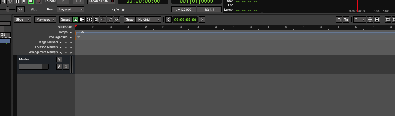
Good upgrading though! Other bugs have been resolved.
Questions to clarify though:
What would be ideal for you?
-Perhaps being able hide beat numbers entirely?
-Or just have bars/beats clearly differentiated with different fonts/sizes?
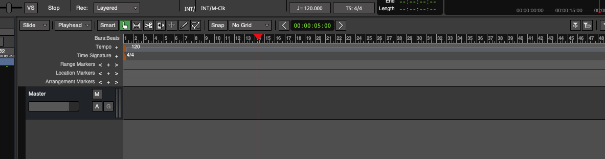
Well, obviously I’m interested in seeing the main bar numbers, the secondary subdivisions may not even be there… Anyway, apart from this little problem, the rest seems to be ok.
For example I just need to be able to go from measure 132 to measure 133 without any intermediate numbers.
But I’d like to avoid reading:
… 132 2 3 4 133 2 3 4 134 2 3 4 …
@paul Beyond solving why @atux’s fonts are the same, maybe you want to emphasize their (bars vs beats) visual difference even further?
Or maybe you want to add a setting (in prefs) that can disable showing beat numbers entirely?
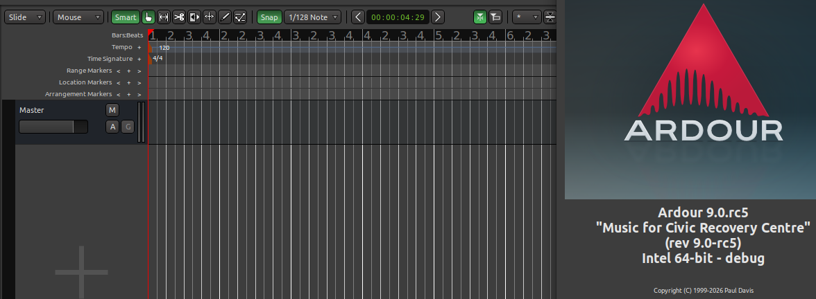
I totally get you now. You can do this, on some level, by zooming-out far enough, of course:
But clearly the large, 100% identical fonts you’re seeing for bars/beats is some kind of bug, or interference from a font-related setting somewhere, or during building, etc…