Hello!
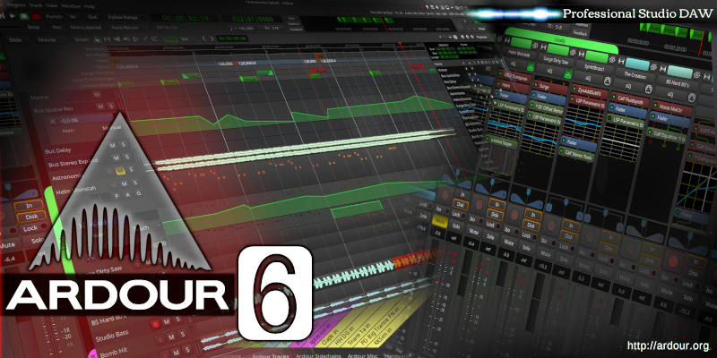
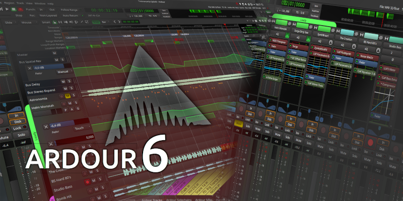
This is the result of my vector playing with the splash pictures of Ardour in Inkscape. I’ve made it to differ Ardour5 and Ardour6 while the launching. Maybe this could be interesting to others. If somebody will want to continue an idea - there’s " ardour6-custom-splash.svg"
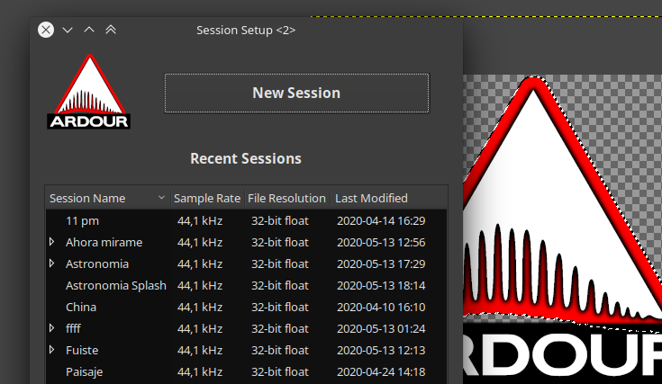
Hi
Kdenlive’s welcome screen surprised me and made me remember this post.
I took some time to create something similar that maybe you can include in Ardor version 6.
The type of font (Ubuntu medium) is representative since it must be licensed, I would have to find a free font that I like.
Sorry my English is bad
Best regards.
Edit: from my point of view I would add “Professional Studio DAW” It is the same but sells more
) I didn’t think about the licensing of fonts. My overlook. I also used some kind of “ubuntu”. Thank you!
I’ve tested your picture - it has not an original size 800х400 (original is 400x348), but works fine. Transparency thing looks smart!
Everything is subjective :). It was my attempt to make something new. Good to know that somebody else have the same passion (ardour )! I’m not waiting any kind of favor in my affords, I use it for my own and share. If any idea of us will take some effect - super.
I like the powerful possibilities to customize the program from many sides! It’s all thanks to open source and flexible structure!
Edit: open source is more a programming goals, but for us as users the open structure is a feature :).
I don’t want to discourage things, but something to keep in mind when looking at projects like this is the importance of branding for any project.
Ardour’s current icon was designed by a graphic designer a few years back and is part of the branding of Ardour itself. Due to the way trademark laws in the US at least, I would suggest people try to be consistent with things chosen as part of that which includes the icon, but also font choices and orientation of the icon as well to identify the software. The stronger the use of the brand the easier it is to defend trademarks if someone uses a somewhat similar branding for their ‘not as good’ but similar product.
For similar examples looks at Blender’s splash screens where even though the splash screen changes a bit, the iconography and font choices are fairly consistent, only changing together as a single unit when an update to the brand is done (Between 2.49 and 2.5 which was a major update for Blender as 2.5 was really about the transition to 2.6 and changed a lot of the UI interactions of Blender)
That is probably the reason why it has aged well over the years. The custom font also made it easy to create a unique visual association. That is not something to abandon lightly.
I understand, I will adjust to Logo and typography and I will make it available again.
As for the sources, I started looking for their licenses, there were no problems, but it is good to know what we are dealing with.
I’d like to add one thing else. I must admit when I tried to use my custom logo as icons - I realized that it doesn’t work. The original logo looks much more readable and clear. Great work by artist Wilms! I liked a calm and deep approach from all sides. Thanks!
I see both sides, brand recognition is a very important thing and Ardour’s battle for acceptance and recognition in the DAW Arena has been hard fought and well deserved.
But things change and graphics change as well as we’ve seen in the transition from things looking shiny and metallic to looking papery and flat. Even for my own small project I’ve transitioned from a shiny 3D looking logo to a flat one but have retained the main recognizable attributes of the logo…
To be honest I think the Ardour splash needs an update, it hasn’t changed since Ardour 2 and the rest of the program has changed to an incredible degree, I say keep the original logo graphic as intact as possible but jazz up the splash like the great examples we’ve seen here already. A splash is a funny thing that flashes by in seconds when you launch a program but it has a very strange influence on the mind about the quality of what you’re using…
Yea my intention wasn’t to say ‘Don’t look at the splash’ but rather ‘Try to keep in mind existing branding when creating your splash’
For instance I think it could be interesting to do a small splash contest similar to what Blender does, but it also isn’t a huge hill I am willing to die on as in my opinion it is better to be conservative than rather than flashy in my experience.

 )! I’m not waiting any kind of favor in my affords, I use it for my own and share. If any idea of us will take some effect - super.